Data Analysis Software : Gephi
Data collection : We Collect Data from FaceBook by using netvizz (Depth parameter- 2).
Data Analysis: We use page like network module to analyze the data network of BCB (Bangladesh Cricket Board) official facebook page Bangladesh cricket-the tiger’s.
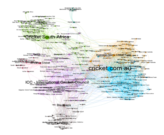
We use page like network module to analyze the data network of BC Facebook page which is being connected through like by others cricket pages. In the data, each pages from cricket world is identified as a node. There are 1769 edges along with 235 nodes represents a directed graph and shows that 235 cricket pages interconnected through like network in between them. Eventually data predicts the most 4 popular Facebook pages that signifies clustered. We have used layout algorithms by setting repulsion strength on 3000 in order to make an aesthetically pleasing representation of our data analytics.
Explore The Data-set according to our Analysis :
- Calculate some overall network measures (like density, clustering, betweenness centrality, degree centrality). What do these measures tell you about the network?
- Density: from the density graph we found 0.032 density of the network which is quiet low to describe its network connection with all cricket pages, since most significant pages have highly connected nodes on graph. Such as Cricket South
- Clustering: for directed graph we use directed mode to find how nodes are embedded in their neighborhood. The average clustering co efficient give an overall indication of the clustering in the network.
- Average Clustering Coefficient: 0.394
The Average Clustering Coefficient is the mean value of individual coefficients.
- Betweenness centrality: hence most common pages are liked very often, so their betweenness centrality should be high. The first place holds the most popular liked page in social media in cricket world is cricket .com.au has a 15627.942264 betweenness centrality where Bangladesh cricket has comparatively very low on 2348.902423. This means, Cricket.com.au nodes are more likely to be in communication paths between other nodes. Moreover, this node determines the bigger interconnection between nodes that would be cut off in case this node would disappear.
- Degree centrality: the average degree for this graph is 7.528.
The popular facebook pages of cricket has growing number of degree centrality in context of page like networks. From the dataset the big node like cricket.com.au, has highest in degree and out degree where Cricketsouthafrica is in second place and ICC is third and consecutively followed by smaller degree. This says that, cricket.com.au has influence in connecting nodes of degree and being a central nodes it could have spread information and influence others in his immediate neighborhood.
cricket.com.au degree of centrality
- Find the nodes with the highest (in/out) degree, betweenness centrality and Eigenvector centrality. Are there differences in how the nodes rank in these measures? Why is there a difference?
- In/out degree:cricket.com.au: 87/84
- ICC – International Cricket Council: 48/47
- Cricket South Africa: 39/56
- Australian Men’s Cricket Team: 40/53
- Eigenvector centrality: this is similar to Google ranks web pages: links from highly linked –to pages count more. It determines the nodes are connected to the most connected nodes.
- cricket.com.au: 0.049856
- ICC – International Cricket Council: 0.028939
- Cricket South Africa: 0.022776
- Australian Men’s Cricket Team: 0.021195
- Perform a cluster analysis to identify some highly connected clusters (“Modularity” in Gephi). Can you interpret the clusters that are identified?
Clustered data shows 7 main clusters that are connected. The degree range filter is applied, setting the minimum to 2 connections. We used the Force Atlas algorithm to display the four clusters more evidently. We used the “no overlap” algorithm and removed the edges to make the graph more readable. While analyzing the data, we got many insights like the most popular and active cricket boards in ICC. In the graph above the most popular board are closer to the center of the circle. In a complete graph, all Clustered are connected to each other to the center of the Clustered. In analysis the Gephi Modularity we have found 4 major clusters.
- Cricket.com.au
- Cricket South Africa
- ICC – International Cricket Council
- Blackcaps
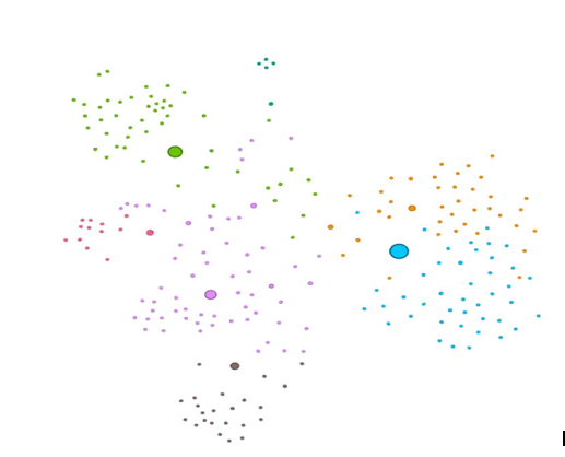
Cricket.com.au is one of the popular amongst these clusters basis on the post activities, fan counts and talking about. The statistics shows that it is very popular among the fans in Cricket World. We have found that the ICC and the local cricketing authorities have a lot of interests in this game across the country and there are a lot of activities are always being going on in the country throughout the year. If we talk about other clusters they are also putting many efforts in the emergence of this game by playing a lot of leagues, championships and first class activities. All these clusters are performing well and according to the fan following across the World they are growing stronger day by day.
- Find a good way to visualize the network by trying different Layout algorithms, different node sizes, colours etc. Take a screenshot and post the picture in your weblog. Explain the most important insights you gained in a few words.
Gephi is software for quickly and easily building network visualization applications that turn data into insight. The Gephi site includes everything what you need to build by your own. For good way to visualize the network we’ve been working on different layout algorithms, node sizes and colors to make our visualization more useful.
Layout Algorithm: The layout algorithms are probably the most important tool to make your data more logical. We try several of them with various settings and come back to them until they fulfill the needs of the current data set. We would like to start with Force Atlas in many cases it gives good results. Once there isn’t much movement going on anymore, we make it stop.
Color Nodes :
The nodes usually represent the main entities in data. This will help us see the cricket board’s connection to the center of the Board.
- The purple Color Nodes looks seems to be about The International Cricket Council (ICC).
- The green one seems to be South Africa cricket board.
- The blue ones appear to me as Cricket.com.au.
We get much more out of visualization if we don’t have to look up everything and can interpret them.
Set node size by in-degree:
We want to know who is the most important nodes in this specific data set. Therefore we go to Appearance -> Nodes -> Size -> Attribute -> In-Degree and limit the size from 1 to 100 after testing around which size works best for this graph. After that we turn on labels and set their size to node size.
Links:
These are the connections between data entities. We use attributes like weight, color and style to communicate different kinds and strengths of connection.
- Find at least one practical question for your dataset that you can answer with the data you have obtained (e.g. which users are similar? who can I trust most? what should the system recommend in a particular situation? which are the most important nodes?
Since this data extracted from the BCB Facebook page, it has identified the potential nodes of this network which are rarely or most often connected in social media. During the analysis we have found that all the users visited these Facebook pages belong to the cricket world that configured color and size by their rank as degree, however they all are similar to each other because all fans visits those pages for getting information related to Cricket. The fans we trust the most are those which frequently visits these pages and having interaction regularly. We have already seen in the graph above that which one is the strongest page on the social media basis of these regularly visited fans. We can tell a lot just from this one image. When we turn on labels, we could see which page each circle represents. The color indicates their grouping, and the circle size shows the comparative strength of the page.
The further out these dots are, the less internally linked the pages are. We can guess by the number of nodes of each color and which sports category has created the most content for their fans. Moreover what are the successful points for them to attract the fans from the external links/resources? For example, we can see a lot of green dots around South Africa Cricket cluster which indicates that it is likely an important practice area for the sports and they are creating a lot of content around it for their fans around the globe.